Branding | Marketing | Design
Common Grounds: Branding Design & Strategy
Scroll ↓
Common Grounds Branding Design
Common Grounds Branding Design
Click to see the full brand strategy above!
ABOUT
For this series of projects, I created a new branding strategy and guide as well as various promotional materials for a local cafe, Common Grounds. I created a new logo, color scheme and mood boards to communicate my ideas for the new branding look and feel. I also created mockups for physical materials in the form of a brand identity system and sample product labels. Finally I created several marketing materials in the form of a brochure and email newsletter in addition to my proposed website redesign. I was able to ideate and execute an entirely new branding design and strategy, complete with promotional materials.
PLANNING
I began by researching a bit about Common Grounds to better understand the kind of logo that would represent the brand well. I came up with four different ideas for potential logos before selecting one to move on with. I also generated several mood boards to further my understanding of the strategy.
Using Canva, I then created a branding guide which included the logo I decided on and a variation, color scheme, typography, brand message and an abbreviated version of the mood boards. I thought the logo was the best way to incorporate the letters “C” and “G” from the cafe’s initials, and to me the swirl of the “G” was reminiscent of steam from hot coffee and the circle around the initials could be interpreted as a cup of coffee.
For the color scheme, I wanted the main color to be red but I also included a few tones of brown to be used in different scenarios. The typography I decided on was a mix of serif and sans-serif fonts, and I thought the playfulness and contemporary feel of the main font contrasted well with the secondary one.
DESIGN
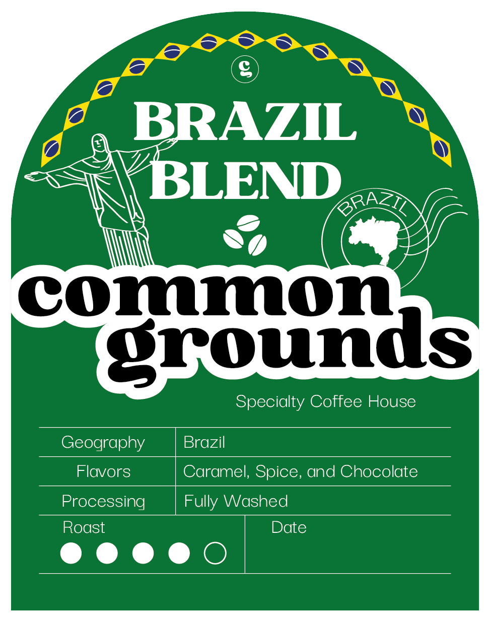
I then incorporated the branding into other materials Common Grounds could use to create an overall seamless brand experience using Adobe Illustrator. I mocked up business cards, an envelope, a notepad and a cup. I also designed three labels for ground coffee beans that stayed true to the brand design I had created but also were a bit more creative.
Using Adobe Illustrator, I designed a two-sided trifold brochure that provided information on the brand and how to get in contact with Common Grounds.
BRANDING
Lastly, I developed both an email newsletter and website design for Common Grounds. The newsletter involved designing an effective layout. I put the most important information at the top, including the brand’s mission and encouraging recipients to visit the website and purchase their coffee beans. I also added the “new flavors” section, which will route viewers to the online menu, hopefully encouraging them to visit the shop.
Click to see the full newsletter above!
The website followed a similar design to the newsletter. I included various features such as an interactive map of their locations, an online menu, store and contact links. Both of the very top headers would remain on any page that a visitor clicked onto so that they could continue to navigate the website or view their cart no matter which page they were on.
For the most part I added pages that the original Common Grounds website already has but just incorporated images so it was more visually appealing.
Click to see the full website above!


